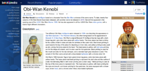
Brickipedia:Usability initiative/Refreshed redesign
From Brickipedia, the LEGO Wiki
The Refreshed redesign is a part of the multi-phase usability initiative by the Brickimedia Association. The Refreshed redesign addresses multiple issues and complaints received about the default skin of Brickimedia. These changes may be deployed as a part of Refreshed version 3.0, intended to be deployed as a BetaFeature in Q3 2014.
The initial problems being addressed in the redesign are:
- Refreshed is usable, but some users think it is not as usable as it could be
- It may be hard for new users to adjust to, since it doesn't follow traditional layouts
- Some users think Refreshed has a relatively unorganised interface
The proposed solution includes:
- Give Refreshed a new layout in 3.0
- Create a more familiar interface like other popular websites use
- Give Refreshed new features that make browsing and customisation easier for individual projects
Changes[edit source]
Sidebars[edit source]
- Refreshed currently has two sidebars (right & left); some users may find this unorganised and confusing
- Remove page actions and TOC from left sidebar, and move MediaWiki:Sidebar content to left bar. Delete the right bar altogether.
- Keeping links on one side of the screen is easier for users and visitors, and also expands the content area to give the more space to read from
Page actions[edit source]
- Page actions are currently on the left sidebar. With the plans in the previous slide, they would be removed from there.
- Move page actions below the page title. This is a central location and is convenient for users and readers, and doesn't disrupt the content area
Search[edit source]
- Moving user tools to the right-hand side takes the spot of the search currently.
- Search bar's location is currently a hassle on mobile
- Search should be made into a single button on the header that when pressed drops down a search bar
Browsing[edit source]
- With the Header enhancements outlined previously, there is lots of free space on the header
- On sites like Mashable and Wikia, the header contains dropdown menus for various categories of content that allow for easier browsing
- Refreshed should include browsing dropdowns like those, and allow individual projects to customise the dropdown labels and their content
Mobile[edit source]
- Make search bar appear after pressing icon on the header, like Mashable's mobile site.
- Make sections collapsible/expandable, where they would be collapsed by default to save users the hassle of excessive scrolling.

